Overview
Based in Vancouver, Fresh Tracks Canada has over 25 years of experience in building over 15,000 personalized vacations for their travellers. The brand aimed to form a platform that will be the most trusted source of information on Canadian travel and tourism in the world. They wanted to become the default presence where people check to see what’s new and where they should go. This platform needs to embody the brand, allow effect and collaborative content publishing and be the central pillar to the customer experience for the company.
Role
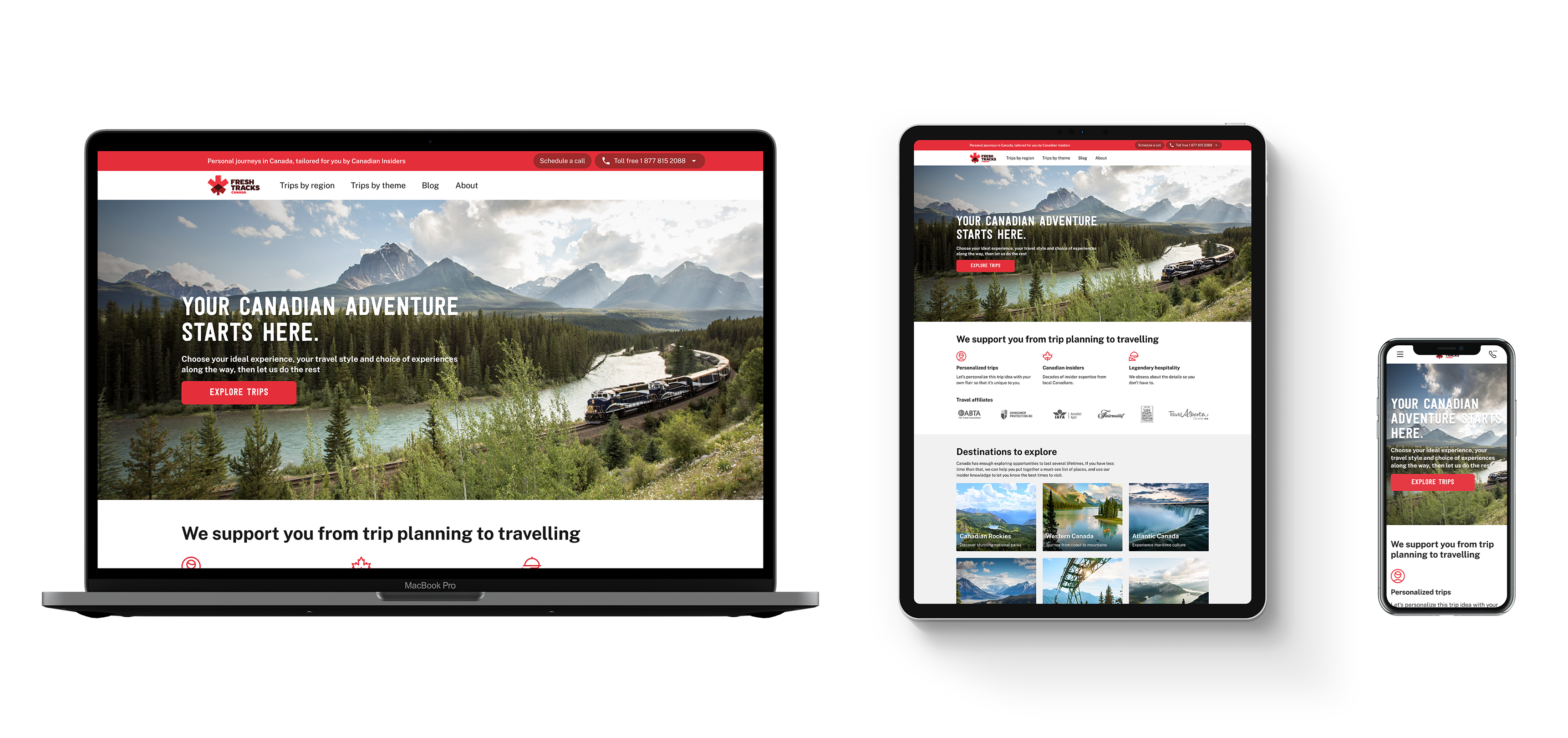
Within my role as the Digital Experience Designer, I supported the discover track of web product development to validate ideas, learn and drive delivery of working designs. I made recommendations and implemented design decisions to improve the experience for new and returning travellers. Some of those improvements include optimizing for better accessibility, increasing the performance of the pages, removing design inconsistencies, and most recently building a design library for the company.
Strategy
The website needed to support a coherent brand experience in every way possible and act as the central pillar to how customers experience Fresh Tracks Canada in order to take our traffic and overall presence to the next level. The objective was for people to recognize our brand, refer our brand and come back for all of the varied trips and experiences. This meant removing the ambiguity that came with their multiple brand approach.
We conducted user interviews with our demographic. From these conversations, trends began to form which highlighted a gap between what we did and what we presented to the customer. People who were unfamiliar with Fresh Tracks Canada needed to know what we did and the value we bring at a glance.
As with most e-commerce sites, we began by baselining our structure on a homepage – category – product format. Alongside my team, we analyzed our own trip structure and build the categories to suit both the information/content model as well as the customers’ needs as they look to explore travel options in Canada. As research took place, it continued to feed into our structure and informed our design decisions.
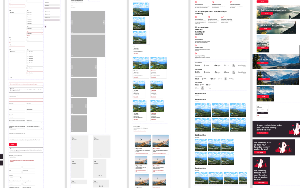
It was important to review and verify the branding we wish to bring forward for the new site. After we defined how the logo, mascot, colour palette, typography, and other content design aspects will be used, I created a design library in Figma to define the standards and guidelines for each category and website components. Fresh Tracks didn’t have one previously so in addition to all the added benefits to the design process and development workflow, it was particularly handy for onboarding new designers and remote collaboration while we were navigating a global pandemic. The web developers were also able to take the specifications from Figma and recreate them in Storybook.
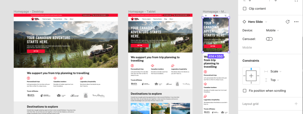
When Figma upgraded their auto-layout feature and introduced variants, I took advantage of those feature to simplify the process of creating mock ups for multiple devices.

Challenges
The existing business is split across multiple sites, which adds a tremendous amount of complexity internally – which ultimately surfaces to our clients as a fragmented customer experience, as does any inefficiencies in the process we work by.
No consistent brand overall, and development and marketing attention favoured 1/5 website.
There is a lot of confusion in what Fresh Tracks offers, who it’s for and how it’s different to other options.
COVID happened.
Sales-led processes and procedures over marketing and customer driven experience decisions. Older technology slows time to market for larger changes and product pivots.

Solution
From the data gathered, we were able to focus on providing the following solutions:
- Increase conversion rates by preventing users from dropping off while they are browsing the pages
- Reduce friction caused by long, overwhelming trip pages while they are gathering inspiration
- Increasing the speed of completing the contact us form simplifying the input fields

