
Overview
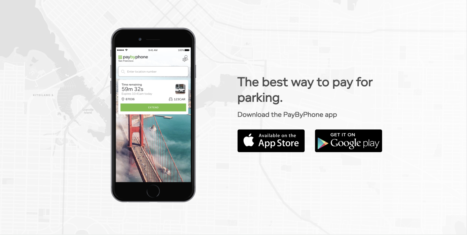
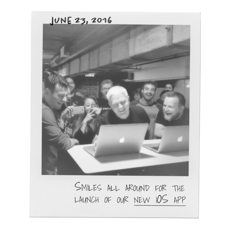
PayByPhone is a global mobile payment solution that allows over 30+ millions of users to pay for parking from their mobile devices. When I joined the company in 2014, all the digital platforms were in need of an update as the mobile applications were essentially a shortcut to the web application. I was the sole iOS UX/UI Designer of the product team, responsible for reimagining the entire parking experience and designing the native iOS application, PayByPhone’s flagship product.
Role
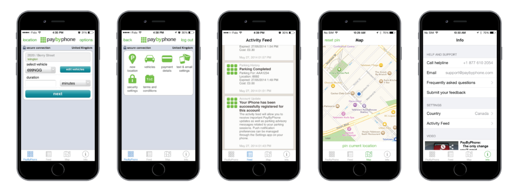
My biggest accomplishment as an UX/UI Designer at PayByPhone was redesigning the parking experience for the native iOS app that over 30+ millions users still use today. Features and experiences I worked on include but does not limit to: branding assets, city signages, onboarding, registration, navigation design, adding multiple vehicles, confirm parking vehicle, adding multiple payment methods (including Apple Pay), parking flow, empty states, parking without an account, parking history, wallet, buying permits (UK only feature), corporate accounts, paying for FPS (France only feature) localization, help & support, in-app & iOS notifications, City of Vancouver’s park until feature, Siri, Apple Maps integration, design library, dark mode, and the Apple Watch experience that was featured in Apple’s WWDC 2018 Keynote.
Strategy
The process at PayByPhone was based on the Double Diamond Theory, the design team incorporated the key phases of Discovery, Definition, Ideation and Implementation into all of our projects.
First step was understanding the business goals. I did a deep dive into competitive research, stakeholder interviews, and reviews of the previous redesign iterations to understand why that version never got to see the light of day. Those iterations were a huge improvement from the web experience at the time, but they weren’t innovative enough to become the industry leading product. Good news: A business that’s investing in research, design, and technology! Bad news: The pressure is on.
Second step was understanding our users’ needs and how they were currently interacting with the app to bridge the gap. I conducted user interviews and created customer journeys to indicate the existing pain points and uncover new ones. This was an ongoing process for me and my product manager, in order for us to continuously learn and better understand the behaviour of our users. We dissected the research findings to determine both the long-term strategies and the short-term tactics of the app.
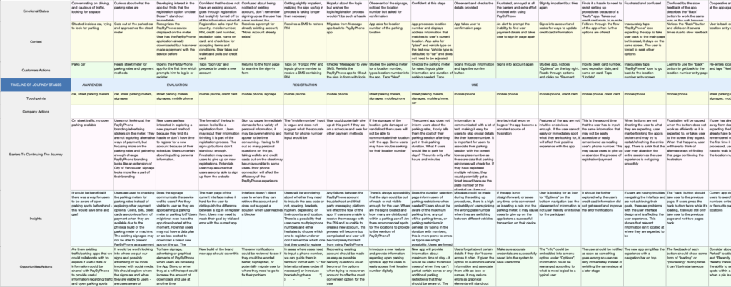
Top findings:
- People don’t like paying for parking.
- People just want to get it over with when they have to pay for parking.
- A long registration process will cause people to abandon. Cash is hassle free if you have change handy.
- People may have trouble seeking for their location number.
- Some people drive multiple vehicles.
- Any technical errors of the app become a constant source of frustration.
- Parking payment confirmation needs to be clear and reassuring.
- Parking restrictions must be clearly communicated and understood.
- If features are not intuitive or there is no visual feedback, it will frustrate people (and cause user errors).
- People need to be notified before their parking expires.
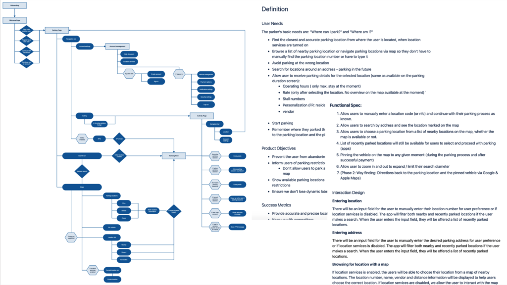
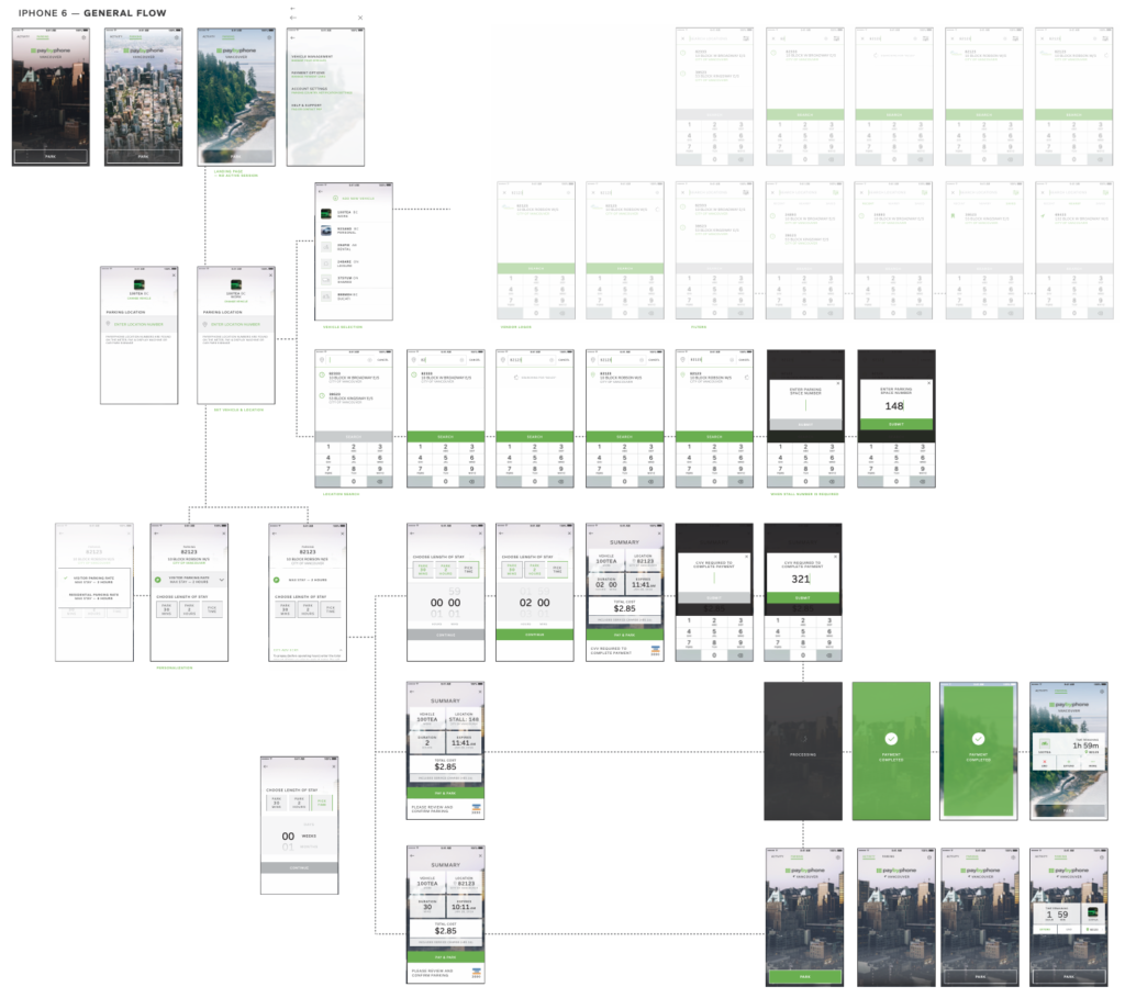
A user flow diagram was created for every task the user was trying to achieve. This helped me visualize the process a person goes through to accomplish each goal, and anticipate different parking scenarios. Some key tasks:
- Onboarding the app
- Registering an account
- Parking flow
- Account management to adjust settings
- Extending a parking session
Based on the above problems identified, I worked towards addressing these pains by ideating potential solutions. A few examples:
- Allow people to skip onboarding to reduce barriers into the parking flow
- Simplify the registration process to reduce barriers into the parking flow
- Make the parking flow as frictionless as possible, anticipate for typos or user errors and allow people to correct their mistakes
- People need to see their active parking session as they may need to extend their parking
- Reduce user error by asking users with multiple vehicles on file to confirm which vehicle they’d like to park
- People need to be able to switch between multiple payment methods for business expenses
- The parking experience should be consistent throughout all digital platforms (iOS, Android, Web)
Even though I was the only iOS UX designers at PayByPhone, I often pulled in a product manager, developer, or stakeholder (or a combination) in for ideation sessions where we would generate ideas as a multidisciplinary team. It was a great way to bring them into the problem space and explore the options as a group. Most importantly, this open environment enabled me to strengthen buy-in for the final design. My favourite way of ideation is generating as many ideas as possible on pen & post-its or markers & whiteboard, always low fidelity before we evaluate which ideas to explore further.
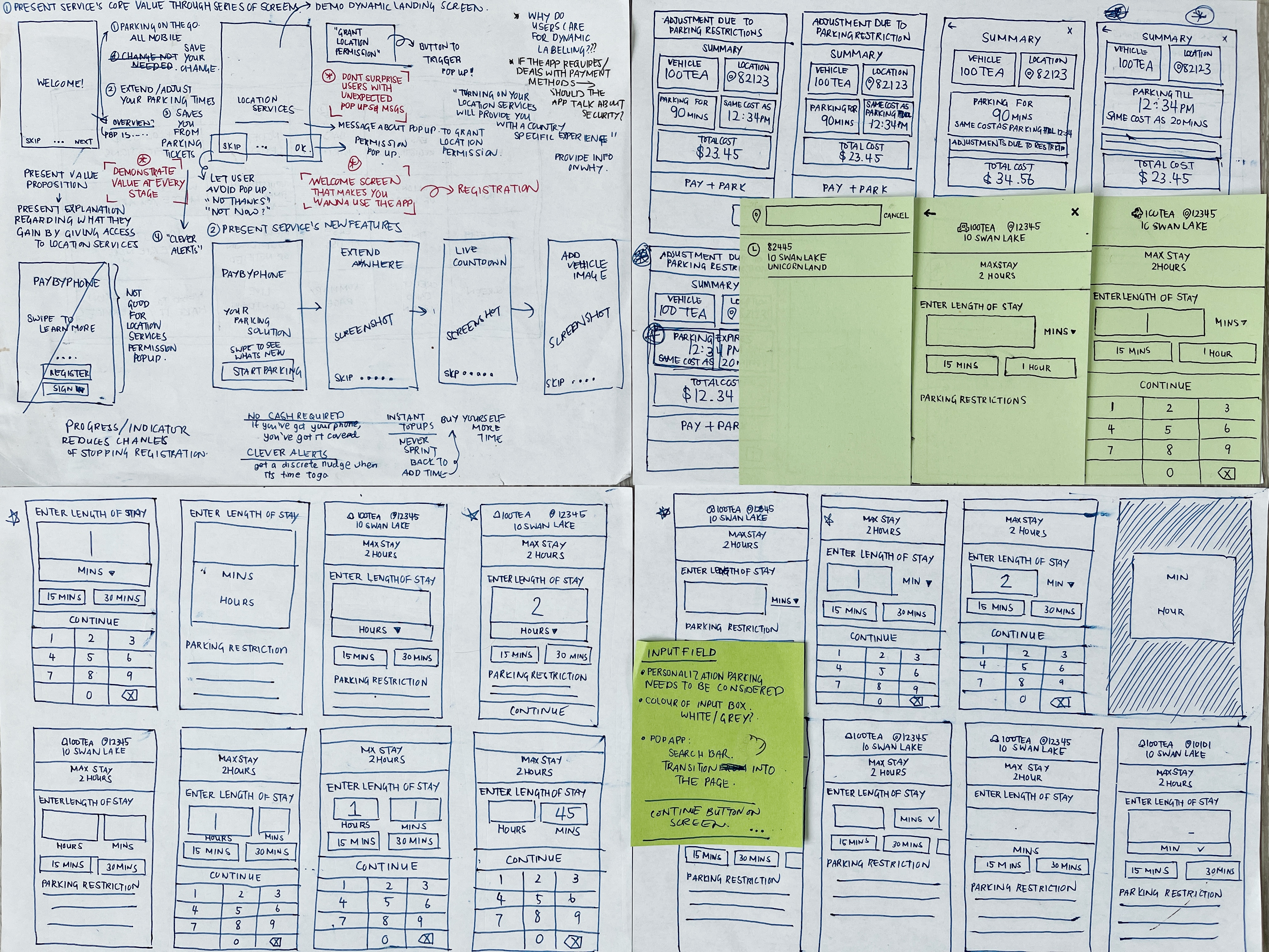
I enjoyed facilitating usability sessions early and often. Once I started creating medium to high fidelity mock ups or prototypes, I conducted usability testing sessions with the primary users to validate whether the new designs would solve their problems and gather feedback. The user testing scripts always included parking scenarios or related to their parking habits.
During the sessions, I would always ask them to speak their mind, think out loud, while I observed how they interacted with the prototype. One of the findings I’ll never forget was around the enter duration interaction in the parking flow: at that time, Apple had a time picker featuring a wheel which you had to scroll to set your date and time. So I took that iconic time picker with the assumption that it was what people were used to since it a standard Apple component. The usability session revealed that the scrolling interaction was arduous, and it was much more efficient to type from a number pad.
Challenges
Screen sizes vary among users, some designs that looked good on a bigger phone never worked for the iPhone 4. Eventually I learned to design with the smallest screen size in mind, and always consider how interfaces behaved on different devices.
Inconsistencies were inevitable and crept in before we had a design library to set standards.
Recruiting external PayByPhone users for user interviews and user testing was a lot harder than expected (especially without a dedicated Research team).
The business always wanted to incorporate maps into the app experience to one up our competitors, but entering a location number was the most user-centric solution in most cases.
Solution
Onboarding was reduced from 6 screens (from 2016) to 3 screens (2019).
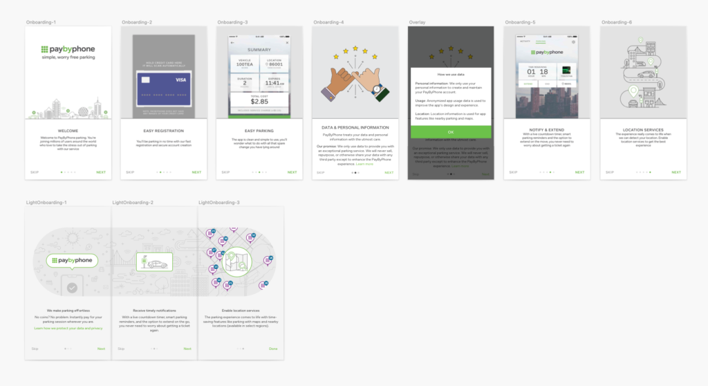
The registration process used to require a phone number, email address, valid credit card (number, expiry date, card holder name, postal code), vehicle (license plate, state, vehicle type) and notification configuration in 2016. In 2019, we introduced One Step Registration which reduced the flow from 4 screens to just one form. Users just had to enter their phone number (for login), email (for receipts), and set a password.
The parking flow went through some serious work. It was previously linear; so if a user entered the wrong location number, they would’ve had to tap back until the first screen. Now all the parking information is interactive so the user can easily correct their parking details.
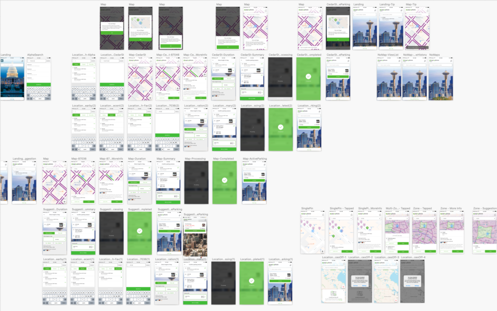
When the first version of the redesign went out, “dynamic labelling” was a big deal. People were able to see their active parking sessions on top of a pretty image of their city. While it made our clients happy, we occasionally had people commenting on the “Park” button. In 2019, we got rid of the unnecessary tap so entering a parking location number was one tap away (previously 2 taps), and introduced nearby parking suggestions when location services were turned on in cities that enabled that functionality.
If a user had more than one vehicle in their account, we added a reminder that made them confirm their license plate before they paid for parking. Since it was an extra interaction, we added a toggle to switch the overlay on or off.
When the app releases were stable, I created a design library with all our digital app components based on the Atomic Design principles. This made it easy for our growing design team to duplicate existing design and add functionality on any page.
Conclusion
I am forever grateful for all the peers I met and collaborated with during my 5 years at PayByPhone. A lot of my design thinking and foundation came from the learnings and opportunities here.
Since the redesigns, PayByPhone became the industry-leading, highest-ranked parking app in the world with 30+ million users & 100k+ five-star reviews in the App Store. The app is used in 400+ cities worldwide & is now available in 12 languages. Here’s the final product:
Awards & Press
Best Mobile App Awards: Best Designed Mobile App 2016 (Platinum place) — Best Mobile App Awards, 2016
Remote parking app PayByPhone gets Apple Pay integration and new design as user growth spikes — GeekWire, 2016
New PayByPhone feature allows Vancouver drivers to park at meter until next day — DailyHive, 2018
Vancouver meters now let you pay in advance for next morning’s parking — CBC News, 2018
City adds ‘Park Until’ feature on parking app to discourage drunk driving — Vancouver is Awesome, 2018
watchOS 5: The MacStories Overview — MacStories, 2018