Overview
In 2018, Apple introduced dynamic notifications during their watchOS 5 release. This allowed third party apps to add additional steps or options within a single notification. At that time, the existing PayByPhone Apple Watch experience was out-of-date, had no functionality, and needed some design love.
Role
I was the sole Product Designer, working with a Senior iOS Software Engineer on the project. I was responsible for determining user flows, ideation, creating wireframes, interaction design, high fidelity prototypes, animation assets, user testing, and supporting development until it was production ready.
Strategy
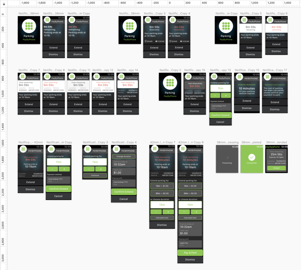
The user need was simple, users just want to successfully extend their parking with their Apple Watch. Since there was no existing flow at the time, I worked with David (Senior iOS Software Engineer) to get a high-level understanding of the technical constraints. After considering possible actions at each moment of the user journey from both a new and avid Apple Watch user’s perspective, I created diagrams to define all the possible user flows, information architecture, functional specifications, and sketched out a few ideas to visualize the desired user flow.
Part of the initial discovery, I chatted with peers who used an Apple Watch on the daily and borrowed a watch to familiarize with the interface, take notes of the highlights and frustrations of existing applications (what better way to get into the mindset of an Apple Watch user than to be an actual Apple Watch user? ;)).
Challenges
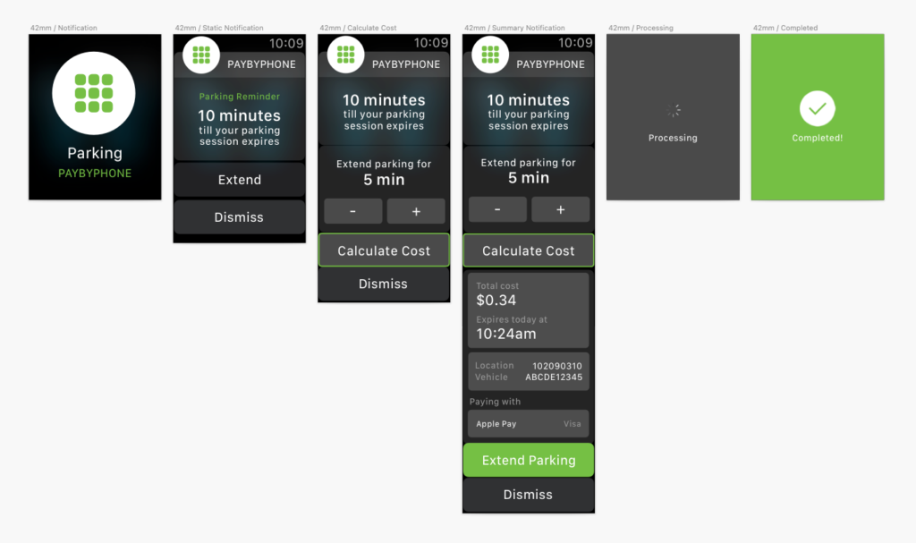
The ideal PayByPhone Apple Watch experience would allow our users to extend their existing parking session by a single interaction when they receive their parking reminder notification. However due to a technical constraint, we couldn’t allow our users to complete their payment without returning a quote from the backend and getting their confirmation.
Designing for soon-to-be released features (exciting stuff!) meant there wasn’t anything in the market to reference.
Solution
I referred to Apple’s design resources for interface guidelines and mirrored the PayByPhone mobile apps’ extend parking flow in the Apple Watch experience.
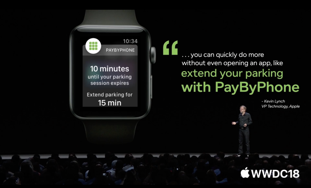
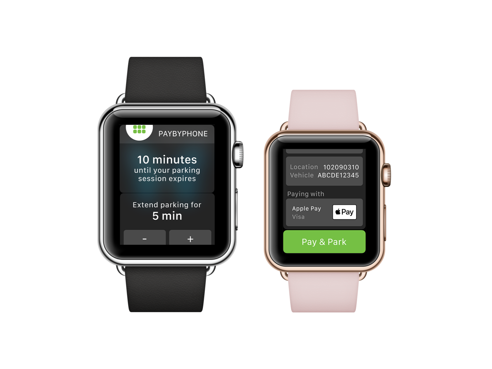
When users receive their “Parking reminder” notification 10 minutes before their parking expires and hits “Extend”, they can use the – or + buttons to increase or decrease the extension time in increments of 5 minutes. Since we couldn’t avoid the extra interaction of calculating cost, we utilized contrasting button colours to define primary and secondary actions. “Calculate cost” button will open an expanded view showing the cost, new expiry time based on the extension you selected above, location number for where you’ve parked and your license plate. “Extend parking” button will confirm payment.
Conclusion
Successfully launched the PayByPhone parking extension feature via dynamic notifications for Apple Watch users. To complete the parking experience on the watch, I also designed and worked with the Senior iOS Software Engineer to enhance the PayByPhone Apple Watch app. Now users can start a new parking session, view their (multiple) active parking sessions, extend their parking flow from their wrists, in addition to all the dynamic notification updates.
The highlight of the project was being recognized by Apple and being featured in WWDC18 — that was probably one of my proudest moments to date.